Claude helped me design my app, I think
Published 2026-04-01
Setlists lets you pick artists and instantly create a spotify playlist of their top tracks. This article outlines my journey using AI/Claude to design the UI for Setlists: what it got right, what it got wrong, what I took and what I ignored.
tldr; Claude is a great starter for getting a working design, but it's up to the human to make it...human.
Introduction
Too many times, I've gone to a DJ set where I didn't know the openers or other djs, and I wished I had familiarized myself with their game. But, there's no time to check each artist’s spotify, listen to all their tracks, add my favorites to a playlist, and listen repeatedly before the concert that weekend.
So, I built an app that creates a playlist from a few artists top tracks. Then, I can use Spotify’s recommendation service or magic shuffle to fluff the playlist.
First, I built it (working prototype first yada yada). Then, I upgraded the UI.
My mvp: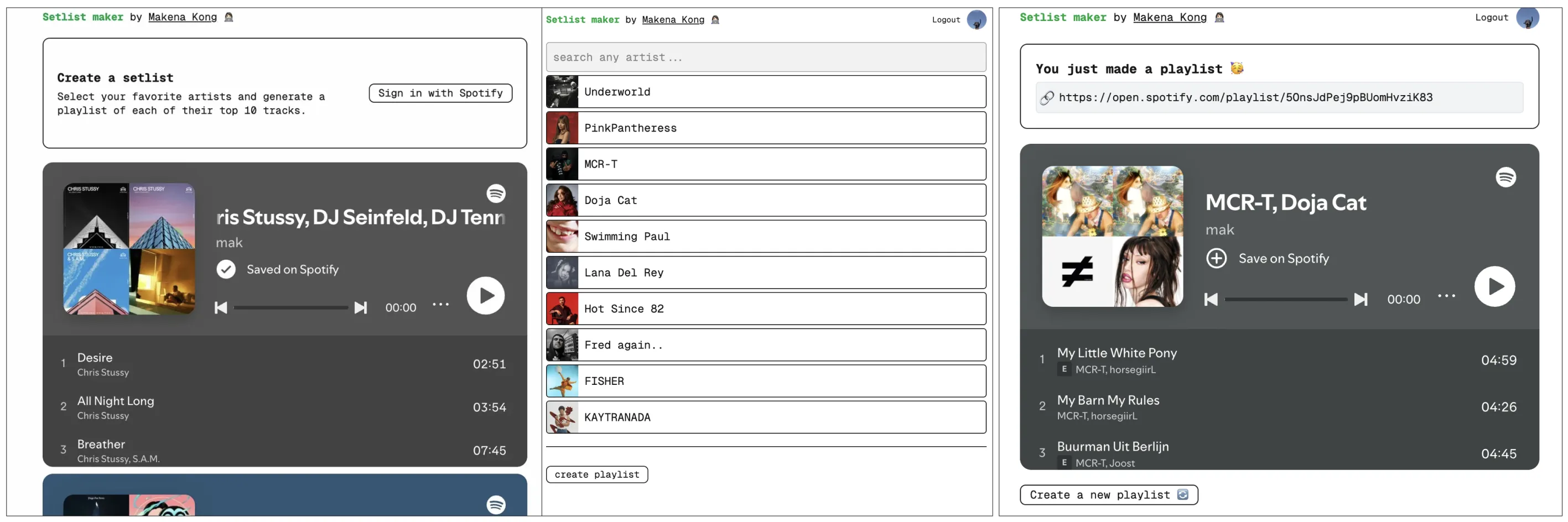
Creative direction
The app is geared toward playlists for sets, mini-raves, small festivals.
It should be a little crude. It should be techno, but not technical. It should be anti-AI (what a catch 22).
Design journey with Claude
tldr; it went something like this: prompt, refine, refine, take what I like, send screenshots, re-prompt, refine, take what I like, repeat
Design journey Pt 1: initial design/mockup
I sent Claude a screenshot of my crude, working mvp and prompted it “revise my design language - going for genz brutalist but trying to make it better”.
Claude's iterations: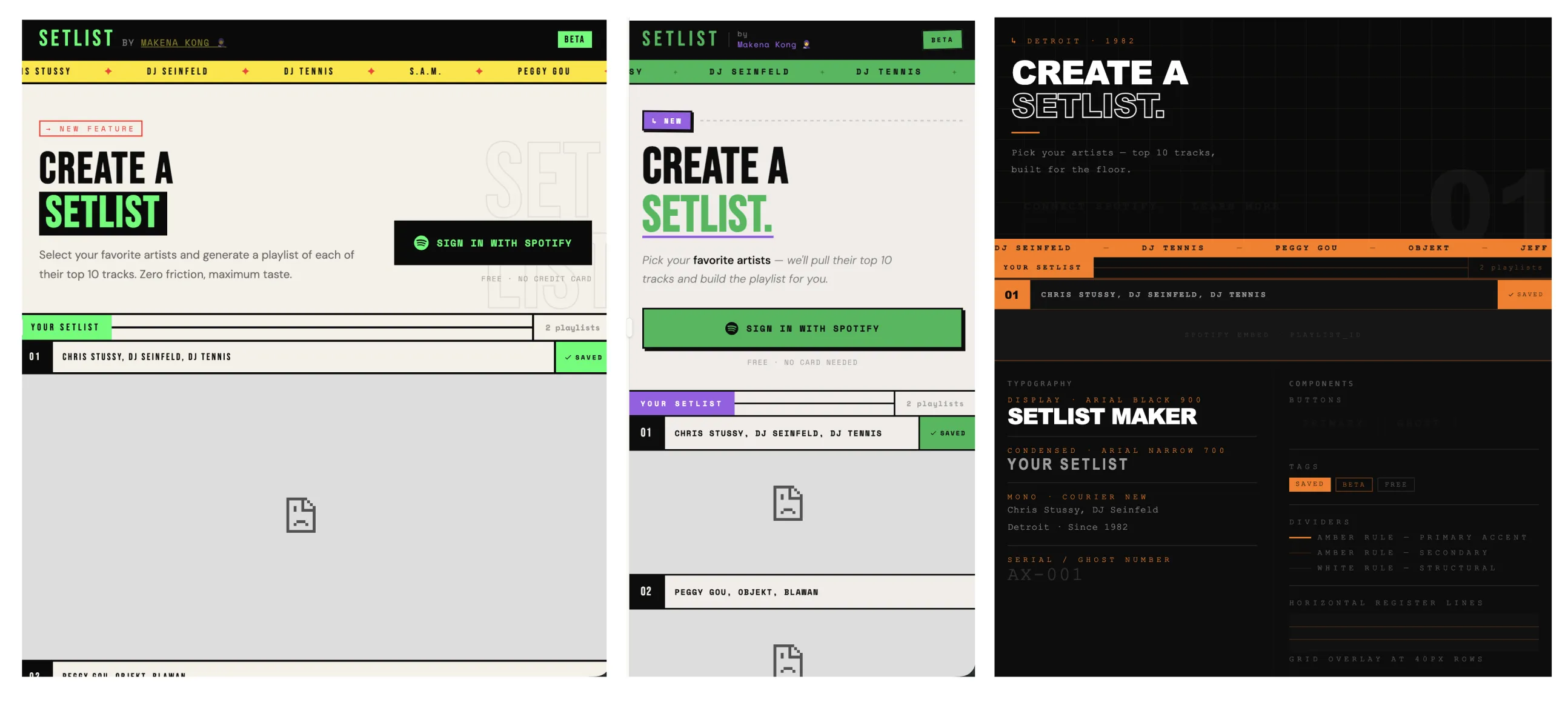
Claude nailed hierarchy with strong typographic contrast, clear visual weight. It got the “brutalism” right, solid font families, but the colors were harsh. This isn't a cybersecurity crypto app - no neon orange or lime green.
I asked for modifications (color suggestions, mobile-first design, accurate spotify playlist embeds).
Then, I took a step back and asked Claude to "GIVE ME SOME DESIGN STYLES FROM TOP TECHNO DJS AROUND THE WORLD".
Claude's techno DJ research: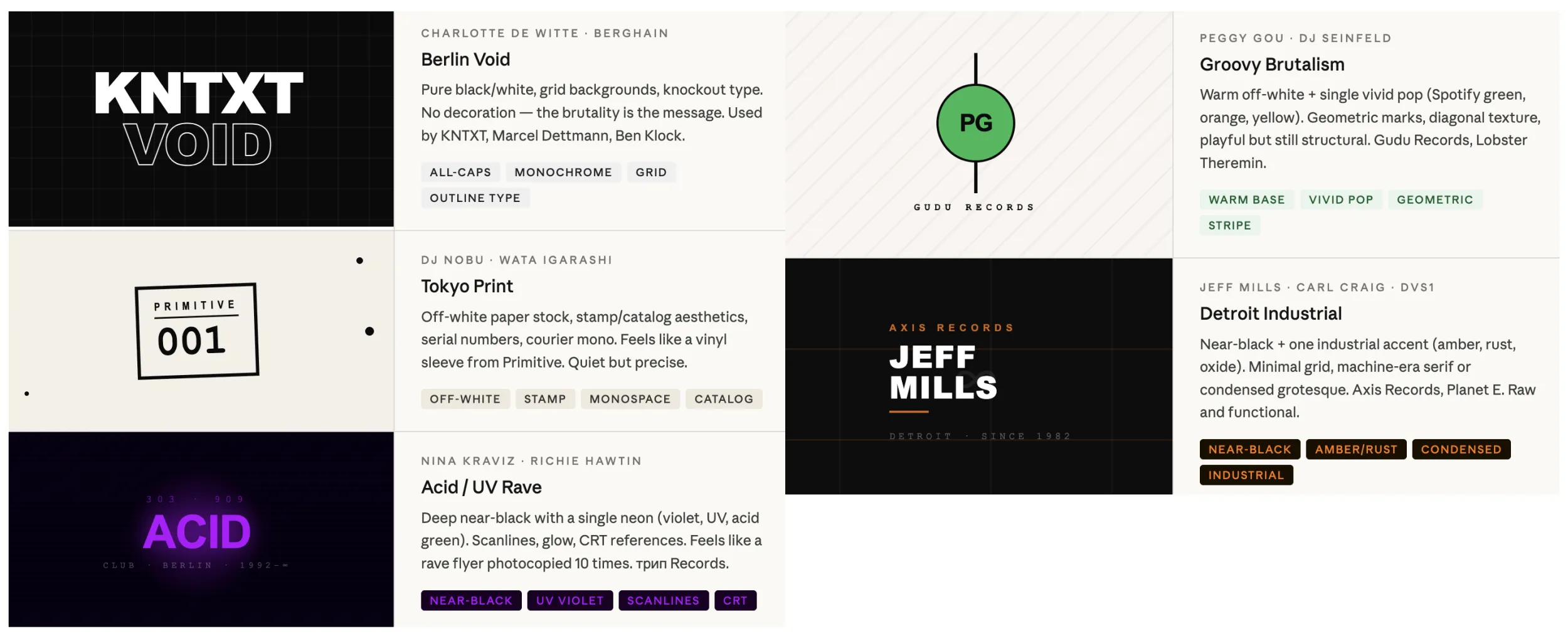
Looking back, this should've been step 1. This gave Claude so much context for building a better design. This was also 100x faster than researching DJs' instagrams and websites and building a moodboard.
I asked it to build off of Jeff Mill's design guidelines and worked from there (see from frame 3 of Claude's iterations image.) I picked Jeff Mills because it was industrial and structured where the others were more poster style or basic.
Then, I took to Figma to rebuild the mockups.
Rebuilding the frames by hand on Figma is tedious, which made me prioritize which elements I need, wanted and didn't care for. I kept the hierarchy, typography styles, colored blocks. The rest of the elements were noise (extra lines, graphics, etc).
My Figma mockups: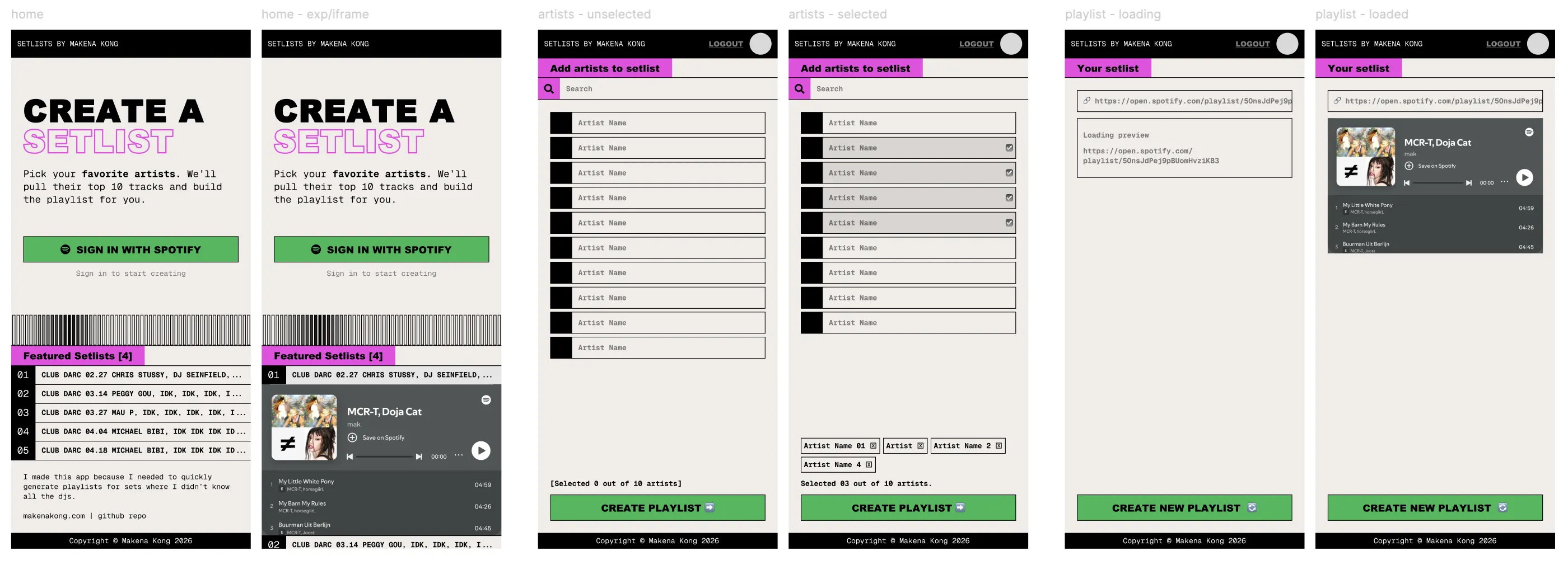
Design journey Pt 2: graphics/logos/icons
I had already a vision of the baby between a stack of CDs on a shelf and a soundtrack sound wave/equalizer bars. I mocked it up and hardcoded it before I realized that it needed to be iteractive.
I didn't know it yet, but this became my visual anchor.
My visualizer (it moves with the cursor):

I wanted more visual elements (and a logo) so I asked Claude "what icon would best represent this app (music icon, mix board, play icons, idk)"
Claude's icon designs:![]()
Claude has some good ideas, but unrealistic execution. It was also stuck on Jeff Mill's brand so I re-prompted asking for a logo based on my own mockup but nothing landed. I realized I had all that I needed (my visualizer bars), the identity was right there.
Claude's logo vs My logo designs![]()
Design journey Pt 3: building it
Then I built it (yes, I did not even vibe-code it, I typed actual code with Claude's assistance via VS code extension).
My demo screenshot: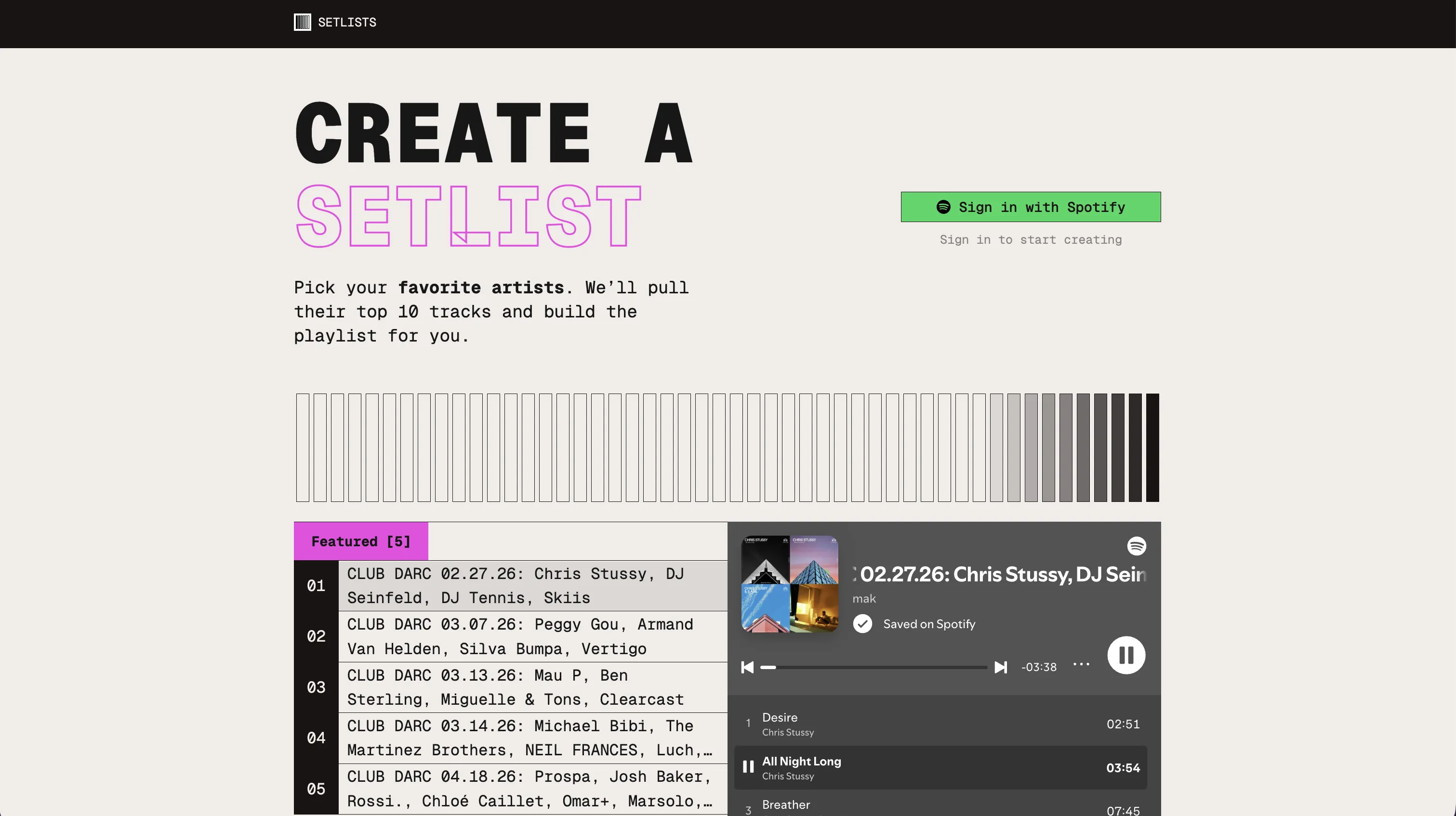
I didn't follow the mockup perfectly, changed some fonts, changed padding/heights/margins etc. I attempted the bordered text, it made a weird kink in the L in 'SETLISTS', but it looked kinda cool so I kept it.
Check it out yourself here.
Conclusion
In terms of design, AI is good for structure and momentum - getting the mvp. It's also good for brainstorming and researching - you can skip moodboarding.
Give it a specific aesthetic and it will generate a usable mockup with good structure, typography, colors and more.
In terms of creativity and uniqueness, I think that's up to us. I'm not sure AI will ever be able to capture that specific feeling.
However, if I didn't know that Claude's original designs were generated by Claude, would I still think that it wasn't very good? I am not sure.
Future plan of action to improve design collaboration with Claude
- Define a strong aesthetic/direction (or ask Claude to help)
- Find examples and elements to draw from (via Claude to gather context)
- Ask Claude to mockup (based on previous research)
- Iterate
Thanks for reading! <3
If you have any thoughts/comments/feelings, feel free to share them with me.
This article was cross-posted on medium